
Light is one of the most transformative elements in interior design. It shapes how a room feels, how colours appear throughout the day, and ultimately how comfortable and welcoming a space becomes. One of the questions I am asked most often is how to choose the right paint colour according to the direction a room faces. It is something we consider carefully in every project because even the most beautifully designed interior can feel flat or 'off' if the colour palette does not work harmoniously with the natural light.
When selecting paint colours, there is no universal 'perfect shade'. The same colour can appear warm and cocooning in one room, yet cold and flat in another - simply because of the orientation of the home. Understanding how to best complement the light in a north or south facing room is one of the most valuable starting points when creating a home that feels balanced, elegant and timeless.
When we developed the LHL Paint Collection, the intention was for it to work beautifully within all rooms within a home. So many of the shades intentionally lend themselves particularly well to specific lighting conditions.

North Facing Rooms
North facing rooms typically receive cooler, diffused light throughout the day. While this can create a beautifully calm and serene atmosphere, it can also make certain colours feel more muted or shadowed, particularly in the winter months when the natural light is more blue, or in rooms with very limited natural light.
In these spaces, I tend to avoid shades that feel overly stark or icy as they can quickly make a room feel cold and uninviting. Instead, I favour warmer neutrals and earthy tones that introduce softness and depth whilst still maintaining a sophisticated feel. My tip would be to work with the natural light rather than against it.
Warm Neutrals
Warm off-whites and creamy neutrals are incredibly effective in north facing spaces as they gently counterbalance the cooler daylight. These shades help create a softer, more welcoming atmosphere whilst still keeping the room feeling light and elegant. Within the LHL paint collection, shades with subtle warm undertones work particularly beautifully in these rooms. They provide a timeless backdrop that feels refined rather than yellow or overly pink.
Taupes & Soft Earthy Tones
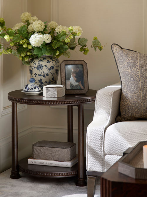
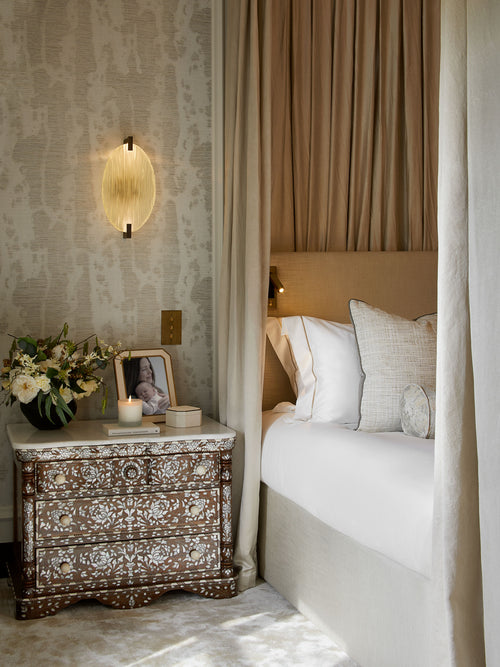
For clients who want greater depth or a more cocooning aesthetic, I often introduce soft taupes and earthy mushroom tones in north facing rooms. These shades respond beautifully to shadow and create a luxurious layered feel, particularly when paired with textured fabrics, natural stone and warm metallic accents. In reception rooms or studies, deeper taupes can create an incredibly elegant atmosphere that feels intentional and calming rather than dark.
Muted Greens
Muted green tones can also work exceptionally well in north facing rooms because they bring an organic softness to cooler spaces. I particularly love these shades in kitchens, bathrooms and garden-facing rooms where they create a connection to the outdoors. The subtle warmth within the right green prevents the room from feeling clinical whilst still maintaining a fresh and understated look.
Colours to Approach Carefully
Pure brilliant whites, cold blues and cooler greys can become quite harsh in north facing light. While they may appear beautiful on a paint chart, they can often feel flat or cold-toned once applied within the home. This doesn't mean cool tones can't be used, but they will require careful balancing through lighting, texture and furnishings.


South Facing Rooms
South facing rooms benefit from warmer, golden light for much of the day. These spaces naturally feel brighter and more sun-drenched, which I find makes them incredibly versatile when it comes to colour selection. The abundance of warm natural light means colours often appear richer and more saturated. In these spaces, I tend to focus on creating balance and refinement rather than adding additional warmth unnecessarily.
Soft Whites & Elegant Neutrals
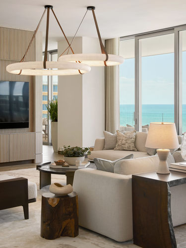
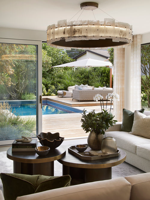
South facing rooms are one of the few spaces where softer whites can truly thrive. The warm daylight prevents them from feeling stark and instead creates an airy, uplifting atmosphere. This is ideal for open-plan kitchens, family rooms, garden rooms and larger entertaining spaces where brightness and openness are part of the overall design intention. Elegant neutral shades from the LHL collection work beautifully here, particularly when layered with natural materials, tactile upholstery and subtle tonal contrasts.
Cooler Greys, Blues & Stone Tones
Because south facing light already introduces warmth, cooler greys and stone-inspired neutrals often feel beautifully balanced in these rooms. I particularly love using these tones in contemporary interiors where a calm, architectural aesthetic is desired. They create a sophisticated backdrop without feeling cold or clinical. In larger south facing spaces, these colours also help soften the intensity of direct sunlight and create a more grounded feel.
Deeper Shades & Statement Colours
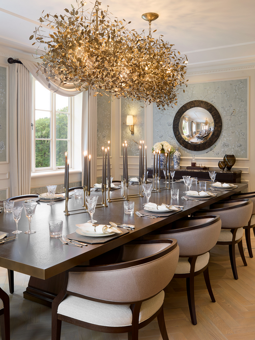
South facing rooms are often the perfect setting for richer colours because the natural light allows them to reveal their full depth and complexity. Deeper greens, dramatic taupes and more saturated neutrals can feel incredibly luxurious in these spaces, particularly in dining rooms, libraries or formal living rooms. One of my favourite approaches is to embrace the confidence of darker tones in naturally bright rooms. Rather than making the space feel smaller, they often create an enveloping elegance that feels both contemporary and timeless.


East & West Facing Rooms
Whilst north and south facing rooms tend to create the most noticeable shifts in colour perception, east and west facing rooms also require thoughtful consideration.
East facing rooms receive softer morning light followed by cooler tones later in the day. These spaces often suit balanced neutrals and gentle warm tones that feel beautiful both morning and evening. Bedrooms can feel especially lovely with subtle warm whites or soft taupes that respond gently to the changing daylight.
West facing rooms experience warmer golden light in the afternoon and evening, often creating an incredibly inviting atmosphere. These spaces can carry deeper colours beautifully, particularly earthy neutrals, layered greys and sophisticated greens. Because the light intensifies later in the day, I usually avoid anything overly yellow or excessively warm as it can become overpowering.


Before Choosing Any Paint Colour
One of the biggest mistakes people make when selecting paint is relying entirely on photographs online. Paint is deeply reactive to light, texture and surrounding materials, so I always recommend testing samples directly within the space itself and observing them at different times of day.
Morning light, evening light and artificial lighting can dramatically alter how a colour appears. Our Peel & Stick Samples are great as they provide a mess-free solution to help you sample colours at home without having to paint any walls. They can be easily stuck onto walls and removed without any residue, plus you can move from wall to wall, allowing you to see how the colours interact with light around the room and in different settings.


Creating Timeless Interiors Through Colour
I believe paint should feel considered, elegant and enduring. A beautifully designed home is never about following trends. It is about creating harmony between architecture, light, materials and colour. The right colour does far more than simply decorate a room — it shapes how the space feels emotionally and how you experience it every day.
Understanding the orientation of a room is one of the simplest yet most transformative ways to elevate your interiors. By choosing colours that complement the natural light rather than compete with it, you create spaces that feel effortless, balanced and quietly luxurious.
Discover The LHL Paint Collection